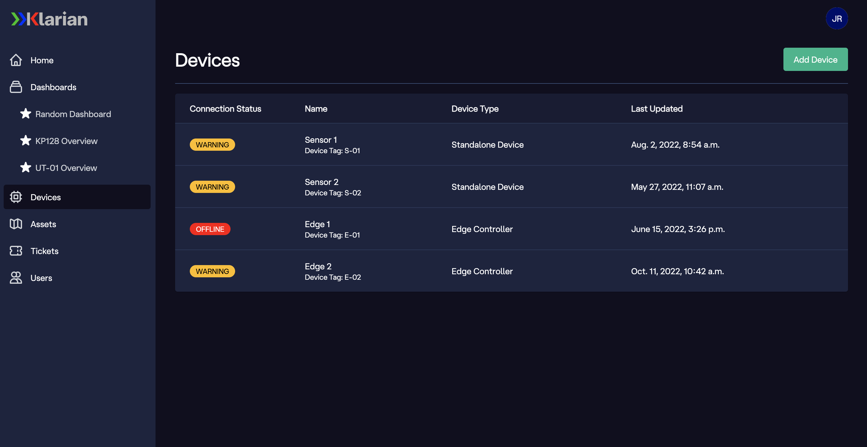
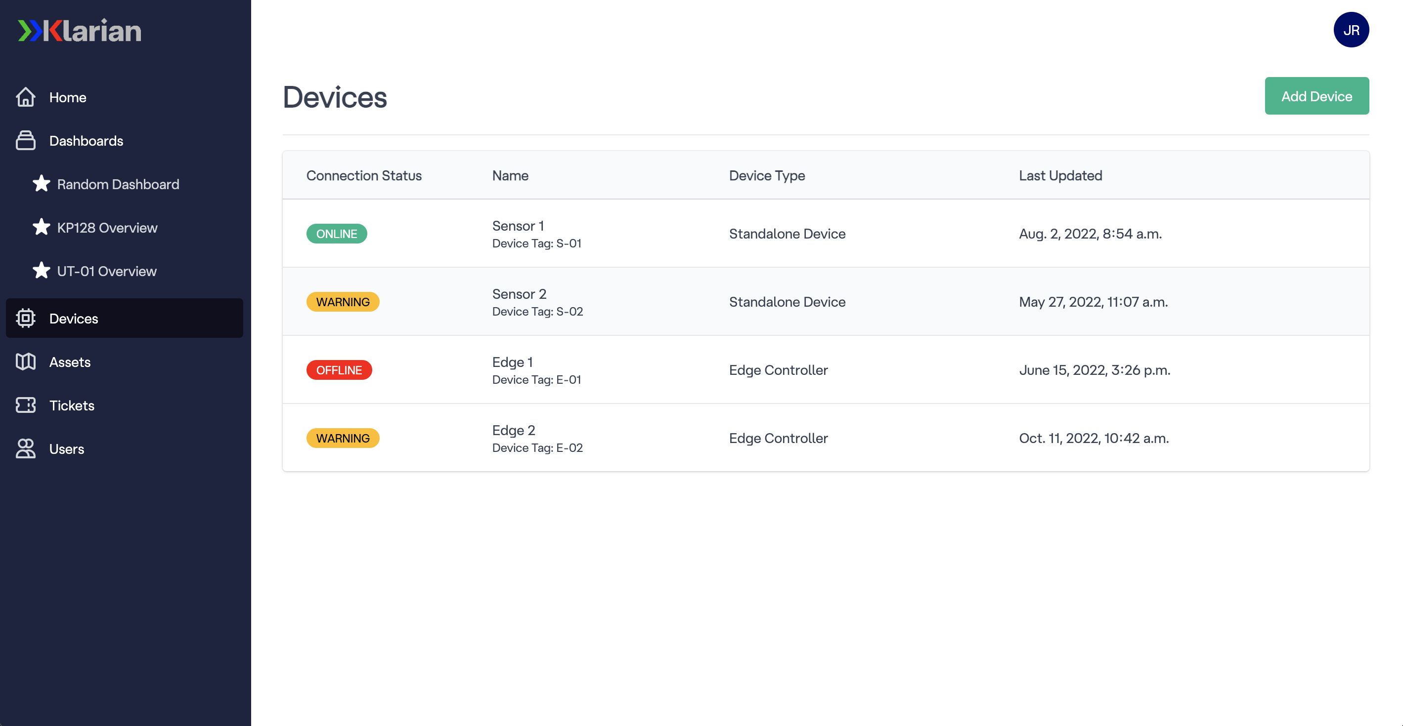
The Klarian frontend in both light and dark mode, featuring a basic device list. Styling implemented by myself.
During my near 4 year tenure at Klarian ltd, I assisted with the creation of the frontend from designing, building, testing and implementation. Initially I started as a Jr. Frontend Developer, creating reusable components within the frontend as well as surfacing and styling JSON payloads. I then progressed into a UI/UX focussed role thanks to my strong design skills, appreciation of software development and ability to empathize with customer requirements.
I became the lead for UI/UX within the company and regularly worked alongside head of technology and software team to create a frontend that had accessibility closely in mind, ensuring regular manual testing and the usage of accessibility checker tools. I was responsible for creating the application color palette and comprehensive design guide in line with the company rebrand, as well as design documents. Day to day I would be designing and implementing UI components in accordance with client requirements, as well as providing feedback to current development builds, in line with UX.
Below you will be able to see some examples of elements I have both designed and styled within the Django templates.
The Klarian frontend in both light and dark mode, featuring a basic device list. Styling implemented by myself.


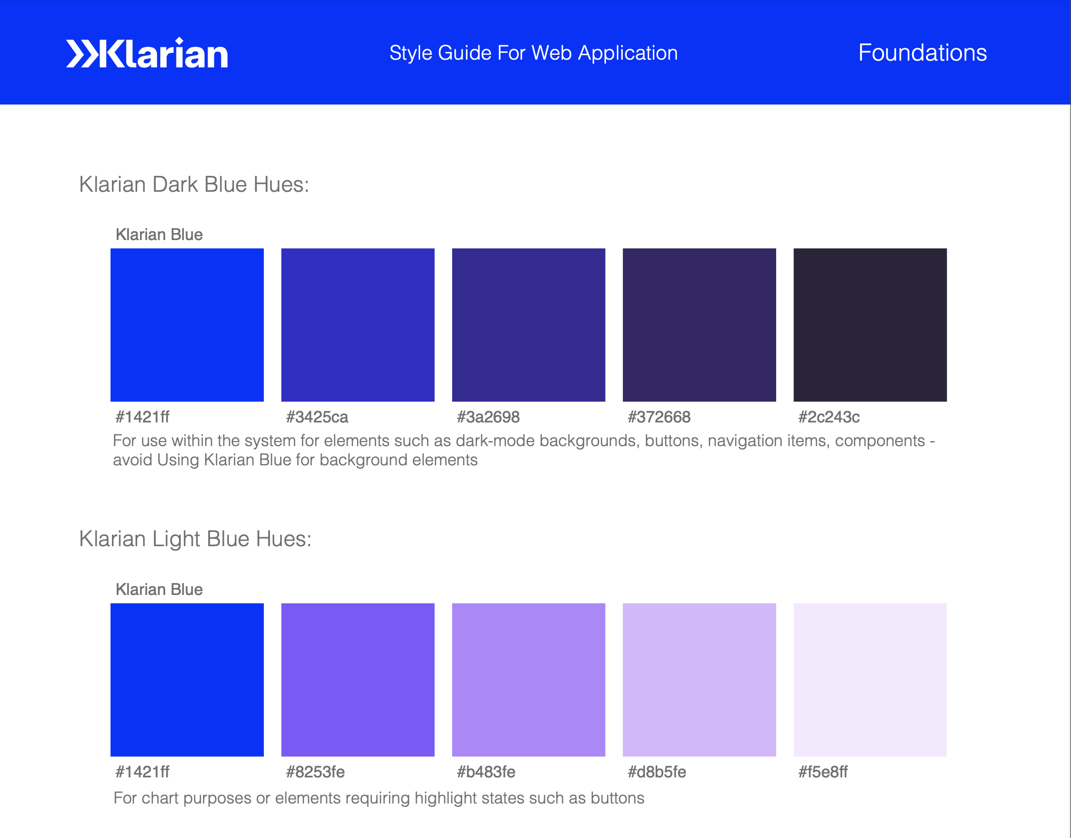
A preview of the Klarian design style guide created by myself as a result of the company rebrand. I produced multiple color palettes as well as extensive design best practices for current and future developers.
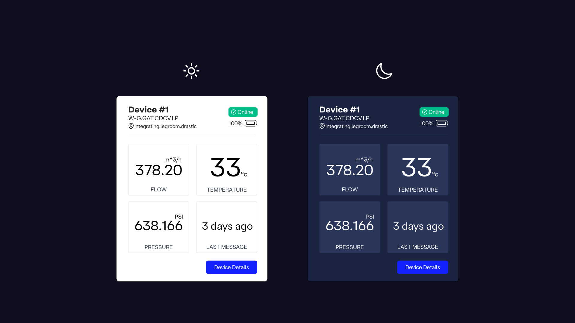
A UI component mock up of a device card for the frontend map view with light and dark mode considered.
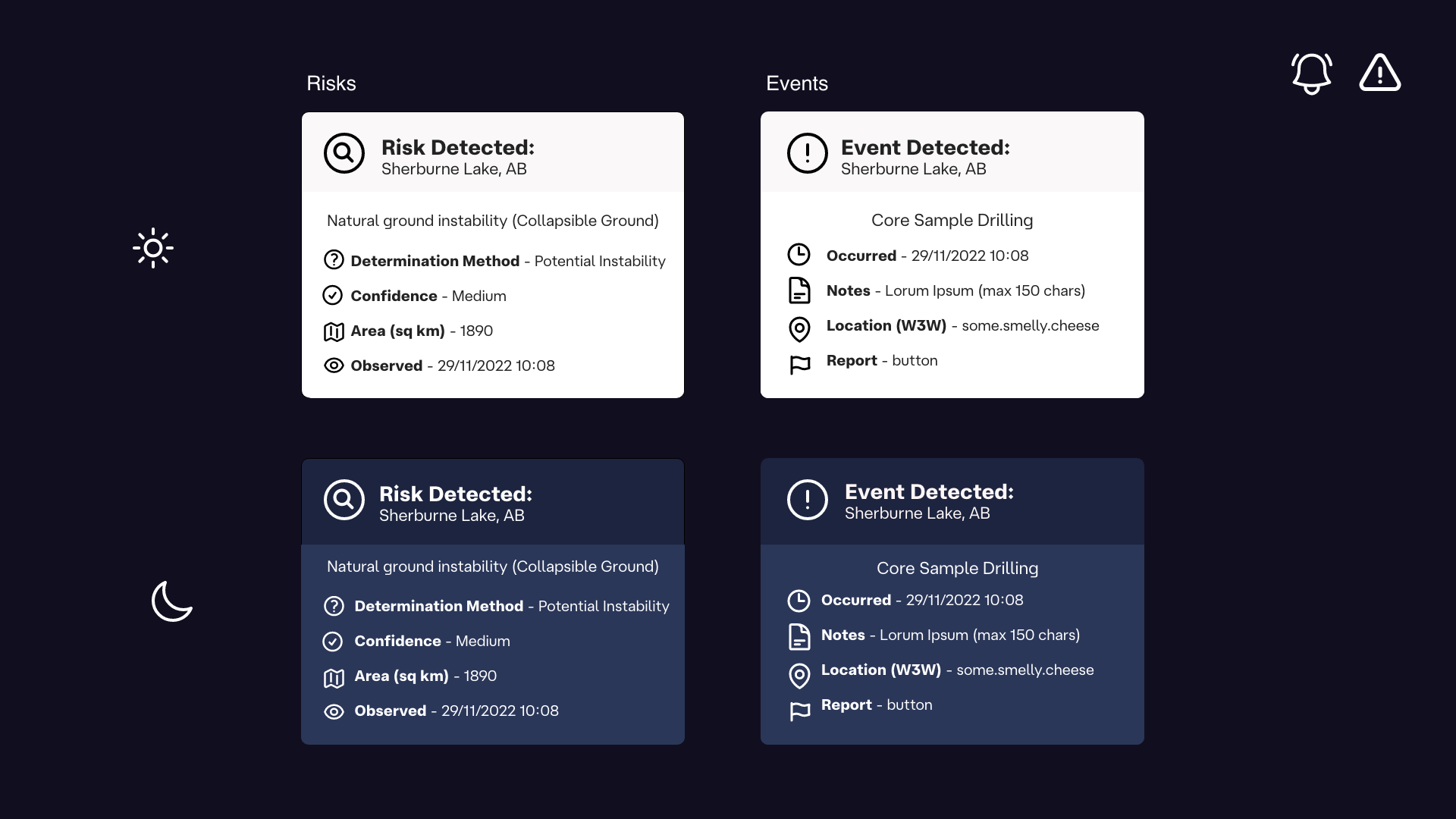
A UI component mock up of a dialogue box for the frontend map view with light and dark mode considered.
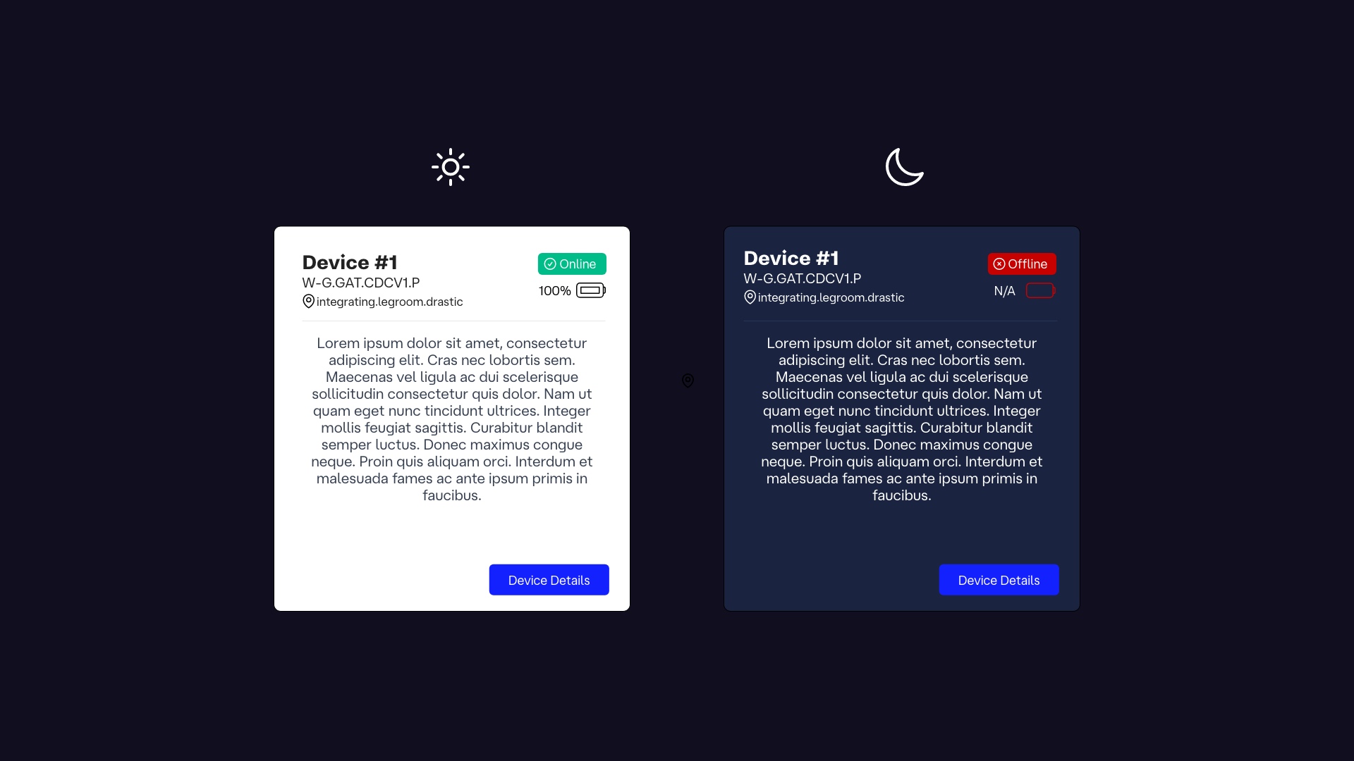
Another UI component mock up of a dialogue box for the frontend map view with light and dark mode considered. This can be seen implemented in other screenshots.
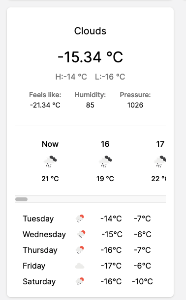
Above is a weather app component I designed and created using Javascript (vue.js) within the first iteration of the frontend application.
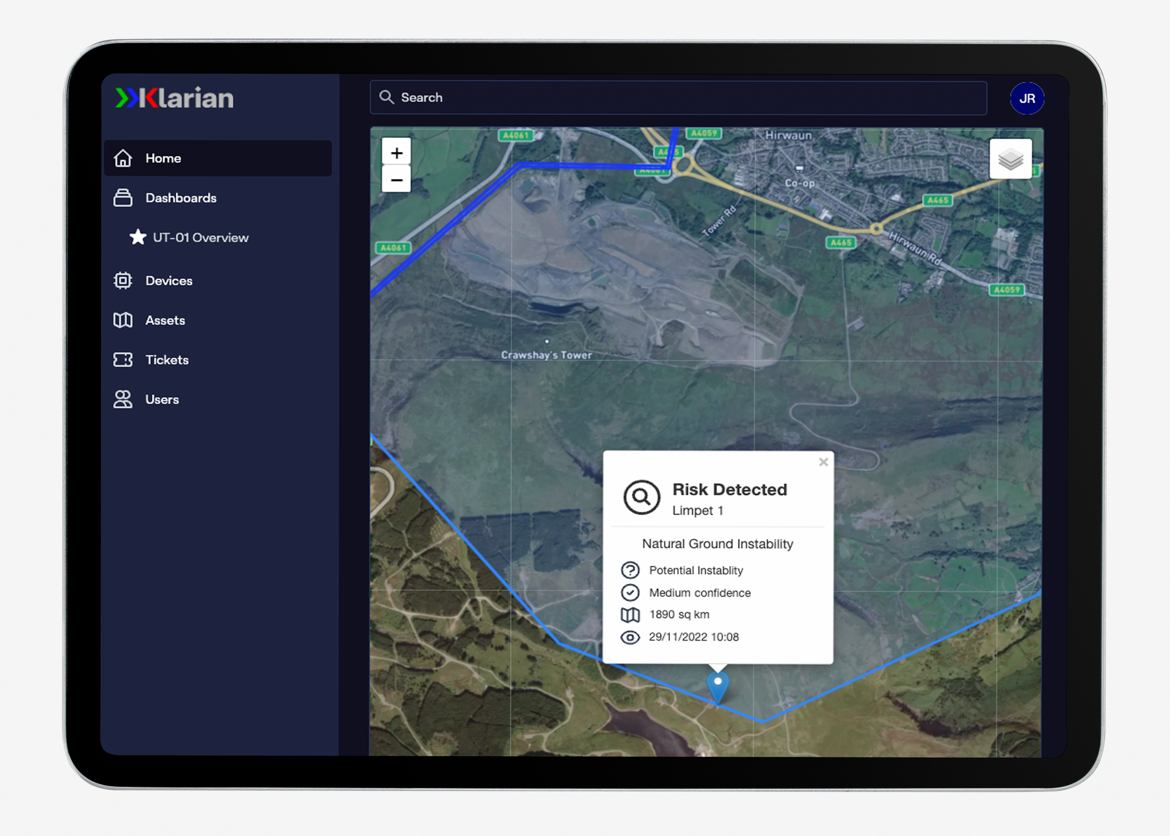
The Klarian frontend in the dark mode map view, within an device mock up created for demo purposes, highlighting mobile responsiveness implemented by me on the frontend.
Map icons created for the map view on the frontend.